![Ravyen Transparent 1390x426-1.png]](https://insights.rayven.io/hs-fs/hubfs/000%20-%20Rayven/Rayven%20Brand%20Assets/Rayven%20Logos/Ravyen%20Transparent%201390x426-1.png?height=50&name=Ravyen%20Transparent%201390x426-1.png)
What Is a Weather Chart?
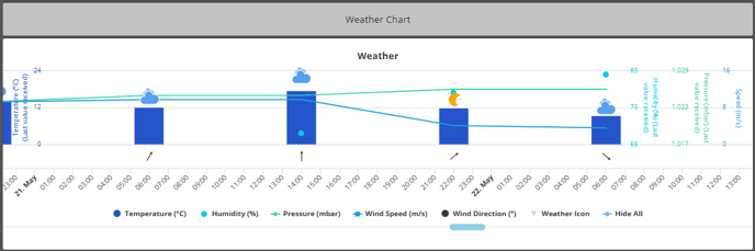
A Weather Chart shows one or more Y-axis values across a time-based X-axis (typically hourly). Each column represents a different weather metric or related value. The chart supports visualization with bars, lines, or a mix and is ideal for real-time and predictive environmental monitoring.
Step-by-Step: How to Configure the Weather Chart Widget Node
-
Add the widget
-
Drag the Weather Chart Widget Node from the Visualizations panel to the canvas.
-
-
Connect the widget to the data source
-
Connect it to the upstream workflow node that provides forecast or sensor data.
-
Each data field must match the configured Y-axis JSON keys.
-
-
Open configuration
-
Double-click the widget to open the settings window.
-

General Settings
| Field | Requirement | Description |
|---|---|---|
| Widget Name* | Required | Title shown at the top of the widget. |
| Widget Subtitle | Optional | Displayed under the title for added context. |
| Show UID / Label Name | Optional | Toggle to display the device label or UID. |
| X-axis Time Interval* | Required | Defines time spacing (e.g., Hourly). |
| Refresh Interval (seconds) | Required | Auto-update frequency (default: 60s). |
| Thousands Comma Separator | Optional | Formats large values with commas (e.g., 1,000). |
| Interval Options Button | Optional | Show or hide interval selection on the live dashboard. |
Y-Axis Column Configuration
You can define multiple series to be shown on the same chart. Each series (column) must be configured individually.
| Field | Requirement | Description |
|---|---|---|
| Y-axis JSON Key | Optional | The field name for the value to be visualized. |
| Y-axis Legend Name | Optional | The label that appears in the chart legend. |
| Y-axis Group Name | Optional | Logical grouping for stacking or axis scaling. |
| Type | Optional | Visual type: Bar, Line, Area. |
| Calculation | Optional | Aggregation logic: - Average, Sum, Min, Max, Last. |
| Link to Interface | Optional | Redirects the user when clicking the data series. |
| Range Min / Max | Optional | Define Y-axis boundaries for this field. |
| Decimal Places | Optional | Value formatting precision. |
| Hex Color | Optional | Choose custom color for the data series. |
Repeat column setup for each additional weather metric to display.
Timeline Settings
| Field | Requirement | Description |
|---|---|---|
| Enable Future Data | Optional | Allows display of forecast or simulated future values. |
| Delay | Optional | Adds a time buffer before data appears (for smoothing). |
| Hide Data | Optional | Toggle to temporarily suppress data visibility. |
| X-axis Date Format | Optional | Choose how dates are displayed on the X-axis. |
Tooltip & Interface
| Field | Requirement | Description |
|---|---|---|
| Tooltip | Optional | Choose tooltip formatting (default, date only, time only). |
| Enable Tooltip | Optional | Show additional context when hovering over points. |
| Add to Interface* | Required | Assign the widget to one or more dashboard interfaces. |
Grouping & Display
| Field | Requirement | Description |
|---|---|---|
| Select Label | Required (if grouped) | Group the chart by label (e.g., site, zone). |
| Grouped Display Mode | Optional | Choose: - No Grouping - Group by Label Value - Group by Label Name |
| Number of Widgets to Display | Optional | Limit the number of rendered grouped charts. |
| Show Data Sources in Tooltip | Optional | Toggle visibility of data source info in tooltip. |
Use Cases
-
Forecasted temperature and humidity display
-
Compare environmental sensors across multiple sites
-
Visualize weather-related production effects
-
Monitor real-time wind, solar, or precipitation metrics
Best Practices
-
Use color coding to differentiate metrics (e.g., temperature in red, humidity in blue)
-
Enable future data to show forecasted information
-
Assign legible Y-axis legends for clarity when multiple series are shown
-
Group by label to monitor multiple locations or zones in parallel
-
Use linking for drill-downs into historical data or alerts
Frequently Asked Questions (FAQ)
Q: Can I mix bars and lines in the same chart?
A: Yes. Each column (series) can have its own display type (e.g., one bar, one line).
Q: How does future data work?
A: Data points with future timestamps will be rendered only when “Enable Future Data” is checked.
Q: Can this chart be used without any grouping?
A: Yes. If no label is selected, it will display data for a single stream or device.