![Ravyen Transparent 1390x426-1.png]](https://insights.rayven.io/hs-fs/hubfs/000%20-%20Rayven/Rayven%20Brand%20Assets/Rayven%20Logos/Ravyen%20Transparent%201390x426-1.png?height=50&name=Ravyen%20Transparent%201390x426-1.png)
What Is a Value Widget?
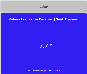
A Value Widget presents one field from your data payload in a compact visual block. You can enhance the display with formatting, symbols, icons, color logic, and link to other dashboards. This widget is perfect for quick-glance insights or real-time status displays.
Step-by-Step: How to Configure the Value Widget Node
-
Add the widget
-
Drag the Value Widget Node from the Visualizations panel to the canvas.
-
-
Connect the widget to the data source
-
Link the widget to the upstream workflow node that outputs the value to display.
-
The field must match the JSON key to display.
-
-
Open configuration
-
Double-click the widget to open the settings window.
-

General Settings
| Field | Requirement | Description |
|---|---|---|
| Widget Name* | Required | Name shown at the top of the widget. |
| Widget Subtitle | Optional | Contextual label shown beneath the title. |
| JSON Key to Display* | Required | Field name from the JSON payload to show in the widget. |
| Show UID / Label Name | Optional | Toggle to show device identifier or label. |
Visual Styling
| Field | Requirement | Description |
|---|---|---|
| Background Color | Optional | Choose fill color using hex code (e.g., #2196f3). |
| Transparency | Optional | Adjust background opacity (0% = solid, 100% = fully transparent). |
| Select Icon | Optional | Choose an icon to appear next to the value. |
| Trend Indicator | Optional | Enable visual trend indicators for directional context. |
Formatting & Display
| Field | Requirement | Description |
|---|---|---|
| Unit Symbol | Optional | Add a unit suffix (e.g., %, °C, kg). |
| Decimal Places | Optional | Set number of decimal digits. |
| Thousands Comma Separator | Optional | Format large numbers with comma separators. |
| Show Last Value* | Required | Select order to display latest value: – Chronologically |
Linking & Interface
| Field | Requirement | Description |
|---|---|---|
| Interface to Link To | Optional | Redirect users to a dashboard when the widget is clicked. |
| Add to Interface* | Required | Select one or more interfaces where this widget is visible. |
Tooltip & Analytics
| Field | Requirement | Description |
|---|---|---|
| Enable Tooltip | Optional | Show custom information when hovering over the value. |
| Tooltip Text | Optional | Optional text shown inside the tooltip bubble. |
| Analytics | Optional | Enable data logging or dashboard analytics. |
Grouping & Display
| Field | Requirement | Description |
|---|---|---|
| Select Label | Optional | Use saved label to group widgets by tag or device. |
| Grouped Display Mode | Optional | Choose: - No Grouping - Group by Label Value - Group by Label Name |
| Number of Widgets to Display | Optional | Limit number of grouped widgets rendered. |
Use Cases
-
Show key performance indicators (KPIs)
-
Display current temperature, voltage, or other sensor values
-
Present summary totals (e.g., units produced, uptime %)
-
Track binary states (e.g., online/offline, active/inactive)
Best Practices
-
Use icons and color to make values more recognizable
-
Apply unit symbols for clarity (
$,%,kg, etc.) -
Group by label to show one value per site, zone, or device
-
Combine with tooltips to explain data source or status
-
Link to dashboards for detailed drill-down views
Frequently Asked Questions (FAQ)
Q: Can I show text like "Active" or "Offline"?
A: Yes. The widget can display alphanumeric values, not just numbers.
Q: Can I use real-time data?
A: Absolutely. The widget will always reflect the most recent value based on your selected update interval.
Q: Can I color the value based on thresholds?
A: For conditional color logic, consider using the Conditional Value Widget or formatting via the workflow.