![Ravyen Transparent 1390x426-1.png]](https://insights.rayven.io/hs-fs/hubfs/000%20-%20Rayven/Rayven%20Brand%20Assets/Rayven%20Logos/Ravyen%20Transparent%201390x426-1.png?height=50&name=Ravyen%20Transparent%201390x426-1.png)
Step-by-Step: How to Configure the Text Field Node
-
Add the node to your workflow
-
Go to Controls in the Workflow Builder.
-
Drag the Text Field Node onto the canvas.
-
-
Open configuration
-
Double-click the node. No input connection is required; it emits values when users enter them.
-
-
Configure the Widget
-
Widget Name: Enter a label that describes what users should input (e.g.,
Set Limit,Enter Comment). -
Output JSON Key: Define the key where the entered value will be stored in the workflow payload.
-
-
Optional Display Settings
-
Widget Subtitle: Add a descriptive sub-label (e.g.,
Enter new threshold value). -
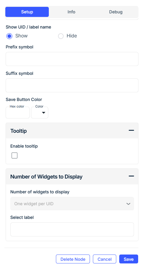
Show UID / Label Name: Display the device’s unique ID or label next to the field.
-
-
Customize Input Symbols
-
Prefix Symbol: Add a symbol before the value (e.g.,
$,@,#). -
Suffix Symbol: Add a symbol after the value (e.g.,
%,kg,°C).
-
-
Style the Save Button
-
Set the button color using a hex code or color picker.
-
-
Add a Tooltip (Optional)
-
Enable a tooltip and enter custom hover text for user guidance.
-
-
Set Grouping Behavior
-
Select Label: Filter widgets by device label.
-
Grouped Display:
-
No Grouping: One widget per device.
-
Group by Label Value: One widget per label value.
-
Group by Label Name: A single widget showing all data.
-
-
Configuration Fields
General
| Field | Requirement | Description |
|---|---|---|
| Widget Name* | Required | The label shown on the dashboard input field. |
| Output JSON Key* | Required | The key used to store user input in the workflow payload. |
| Widget Subtitle | Optional | Additional description under the main field name. |
| Show UID / Label Name | Optional | Show associated device UID or label alongside the widget. |
Symbols & Styling
| Field | Requirement | Description |
|---|---|---|
| Prefix Symbol | Optional | Adds a character before the input (e.g., $, @). |
| Suffix Symbol | Optional | Adds a character after the input (e.g., %, °C). |
| Save Button Color | Optional | Choose a button color using hex (e.g., #1E90FF) or UI selector. |
Tooltip Settings
| Field | Requirement | Description |
|---|---|---|
| Enable Tooltip | Optional | Show hover text for the field. |
| Tooltip Text | Optional | Custom help text shown when hovering over the input. |
Grouping Settings
| Field | Requirement | Description |
|---|---|---|
| Select Label | Mandatory (if grouped) | Choose a device label to control widget filtering. |
| Grouped Display Mode | Mandatory | - No Grouping: One widget per device - Group by Label Value: One widget per label value - Group by Label Name: One widget for all grouped devices |
Note: Device labels must be defined in your Workspace before grouping can be applied.
Use Cases
-
Manually setting thresholds or limits (e.g., pressure, humidity, timeouts)
-
Allowing users to input identifiers, notes, or tags
-
Adjusting workflow parameters in real time
-
Sending field technician comments or operator feedback
Best Practices
-
Use prefix/suffix to clarify units or context (e.g.,
$,%,°C). -
Assign unique output keys to avoid key conflicts in the payload.
-
Use tooltips for contextual guidance without cluttering the UI.
-
Enable One Widget per UID to let each device accept unique inputs.
Frequently Asked Questions (FAQ)
Q: Can the field accept both numbers and letters?
A: Yes. The field supports alphanumeric input.
Q: How is the entered value used in the workflow?
A: It is passed under the configured Output JSON Key and can be accessed using @yourKey.
Q: Can I display inputs for multiple devices?
A: Yes. Use No Grouping for one field per device, or group using device labels.
Q: How can I ensure the value is formatted or validated?
A: Use downstream Conditional Nodes or Script Nodes to validate or transform the value.