![Ravyen Transparent 1390x426-1.png]](https://insights.rayven.io/hs-fs/hubfs/000%20-%20Rayven/Rayven%20Brand%20Assets/Rayven%20Logos/Ravyen%20Transparent%201390x426-1.png?height=50&name=Ravyen%20Transparent%201390x426-1.png)
What It Does
This widget reads values from a selected JSON key in the payload and displays them as a continuous line. It supports configurable aggregation functions, time intervals, axis limits, and tooltip visibility. It can be embedded in one or more interfaces and grouped per label.
Step-by-Step: How to Configure the Single Line Chart
-
Add the widget node
-
Drag the Single Line Chart widget from the Visualizations section onto your workflow canvas.
-
-
Connect a data source
-
Link a node that outputs the metric to be charted (e.g., sensor data, computed values).
-
-
Configure the chart settings
-
Open the configuration panel and define time axis, data field, aggregation, color, and axis limits.
-

-
Group by label if required
-
Choose whether to display one chart per device label or a single unified chart.
-
-
Attach to an interface
-
Assign this widget to any relevant interfaces (e.g., dashboards or analytics panels).
-
Configuration Fields
| Field | Requirement | Description |
|---|---|---|
| Widget Name* | Required | Display title of the chart widget. |
| Widget Subtitle | Optional | Secondary text under the widget title. |
| Show UID / Label Name | Optional | Display the UID or device label name on the widget. |
| Y-Axis JSON Key* | Required | Field from the payload to plot on the Y-axis. |
| Calculation* | Required | Choose from: – Last value received – Sum – Average – Min – Max |
| Time Frame | Optional | Fixed time range for display. Example: Day. |
| X-Axis Time Interval* | Required | Defines the spacing of time intervals (e.g., 5). |
| Time Units* | Required | Select from: Seconds, Minutes, Hours, Days, Weeks, Months, Years |
| Timestamp Interval | Required | Running – true time of data arrivalFixed – rounds timestamps to interval boundaries |
| Refresh Interval (seconds) | Optional | How often the chart refreshes. Default: 60s. |
| Y-Axis Title | Optional | Label to display along the Y-axis. |
| Output JSON Key | Optional | Optional output field name. |
| Y-Axis Minimum/Maximum | Optional | Set bounds for the Y-axis range. |
| Line Color | Optional | Select a color using hex or color picker. |
| Decimal Places | Optional | Number of decimal places shown for Y-values. |
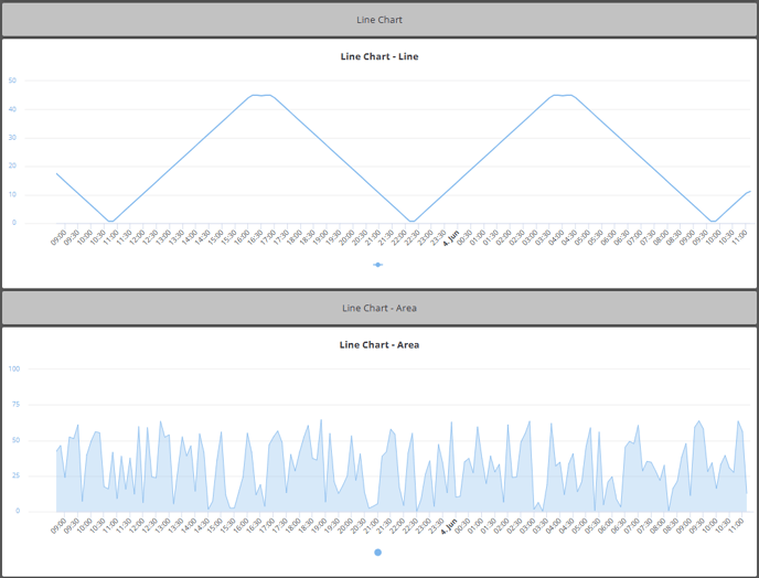
| Display Style | Optional | Choose from Line (default) or Area. |
| Node to Link To | Optional | Link this chart to another node for drill-down or interactivity. |
| Interface to Link To | Optional | Link the chart to another dashboard or interface. |
| Interval Options Button | Optional | Toggle visibility of the user-modifiable time window. |
| Enable Future Data | Optional | Display data with future timestamps (e.g., forecasts). |
| Delay | Optional | Delay display by fixed time to account for late-arriving data. |
| Hide Data | Optional | Toggle to temporarily hide plotted data. |
| X-Axis Date Format | Optional | Customize timestamp display (e.g., Time Only, Date Only, Default). |
| Tooltip | Optional | Customize hover tooltips (default, time-only, or disabled). |
| Enable Tooltip | Optional | Show hover-over tooltip for each point. |
| Show Data Sources in Tooltip | Optional | Include UID or label info in tooltips. |
| Number of Widgets to Display | Optional | One unified widget or one per device label. |
| Select Label | Optional | Choose the label to group multiple widgets (e.g., Zone, Sensor Type). |
Example: Track Energy Consumption Over Time
Configuration
| Field | Value |
|---|---|
| Widget Name | Power Usage - Plant A |
| Y-Axis JSON Key | energy_kwh |
| Calculation | Average |
| Time Units | Minutes |
| X-Axis Time Interval | 5 |
| Line Color | #0088cc |
| Display Style | Area |
| Y-Axis Title | kWh |
| Interfaces | interface2, energy dashboard |
| Number of Widgets | One per label (e.g., by Zone) |
Result
Each chart visualizes average energy consumption in kWh, aggregated in 5-minute blocks. The chart refreshes every 60 seconds and displays a smooth shaded area curve per device zone.
Best Practices
-
Use
Fixedtimestamp intervals for regular bucketed data. -
Label Y-axis clearly with unit (e.g.,
°C,kWh) to avoid ambiguity. -
Use area style for visual volume emphasis, and line style for trend clarity.
-
Apply consistent colors across dashboards to aid user recognition.
Use Cases
-
Plot temperature, humidity, or pressure over time in real-time systems
-
Show energy or water usage trends in industrial environments
-
Monitor IoT sensor signals in production or field deployments
-
Visualize performance or load metrics (CPU, RPM, throughput, etc.)
FAQ
Q: Can I overlay multiple lines on this chart?
A: No. For multi-series plotting, use the Multi-Axis Chart widget instead.
Q: Can I include annotations or threshold lines?
A: Not in the Single Line Chart. Use the Multi-Axis or Histogram with series for thresholds.
Q: What’s the difference between Running and Fixed interval?
A: Running uses actual data timestamps. Fixed aligns data to even buckets (e.g., every 5 minutes).