![Ravyen Transparent 1390x426-1.png]](https://insights.rayven.io/hs-fs/hubfs/000%20-%20Rayven/Rayven%20Brand%20Assets/Rayven%20Logos/Ravyen%20Transparent%201390x426-1.png?height=50&name=Ravyen%20Transparent%201390x426-1.png)
What Is a Multi Value Widget?
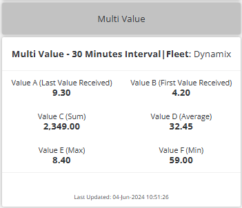
A multi value widget consolidates multiple metrics into a unified block, eliminating the need for multiple separate widgets. Each value is configured individually and can represent different fields, functions, and formats. This provides a clean, readable interface for monitoring critical information in a structured format.
Step-by-Step: How to Configure the Multi Value Widget Node
-
Add the widget
-
Drag the Multi Value Widget Node from the Visualizations panel to the canvas.
-
-
Connect the widget to the data source
-
Link the widget to the upstream workflow node that emits the relevant fields for each metric.
-
All configured Input Data Fields must exist in the incoming JSON payload.
-
-
Open configuration
-
Double-click the widget to open the settings window.
-

General Settings
| Field | Requirement | Description |
|---|---|---|
| Widget Name* | Required | Title for the widget (e.g., Daily KPIs). |
| Widget Subtitle | Optional | Description or context below the title. |
| Widget Header | Optional | Show/hide the header bar. |
| Show UID / Label Name | Optional | Display device name or label. |
| Calculation Interval* | Required | Time frame to use for aggregation (e.g., 5). |
| Time Units* | Required | Unit for interval: Seconds, Minutes, Hours, etc. |
| Thousands Comma Separator | Optional | Toggle to show commas in large values (e.g., 1,000). |
Add Value Rules
Each metric is configured using a rule. Click “+ Add Rule” to define a new value.
| Field | Requirement | Description |
|---|---|---|
| Name* | Required | Label shown on the widget (e.g., Total Uptime). |
| Input Data Field* | Required | JSON key to extract value from. |
| Function* | Required | Aggregation method: Last, First, Sum, Average, Min, Max. |
| Symbol | Optional | Unit symbol (e.g., %, °C, $). |
| Decimal Precision | Optional | Number of decimal places to display. |
| Type* | Required | Choose: Numeric or Alphanumeric. |
| Icon | Optional | Select an icon from the library to display beside the value. |
| Link To | Optional | Choose a dashboard to redirect users upon clicking. |
Conditional Formatting (Ranges)
For each value, you can define color rules based on value ranges.
| Field | Requirement | Description |
|---|---|---|
| ⊕ Add Range | Optional | Define value-based formatting (e.g., green/yellow/red). |
| From* | Required | Lower bound of range (inclusive). Supports dynamic [[rangeX]]. |
| To* | Required | Upper bound of range (exclusive). Supports dynamic values. |
| Hex Color* | Required | Color applied when the value is in this range. |
Tooltip Configuration
| Field | Requirement | Description |
|---|---|---|
| Enable Tooltip | Optional | Toggle to show tooltips on hover. |
| Tooltip Text | Optional | Custom text to appear inside the tooltip popup. |
Grouping & Interface
| Field | Requirement | Description |
|---|---|---|
| Add to Interface* | Required | Assign the widget to one or more dashboards. |
| Select Label | Optional | Choose a label (e.g., Zone, Machine) to group widgets. |
| Grouped Display Mode | Optional | - No Grouping - Group by Label Value - Group by Label Name |
| Number of Widgets to Display | Optional | Limit the number of rendered widgets in grouped mode. |
Best Practices
-
Use icon + color + label to make each value easily scannable
-
Keep rule names short and meaningful for fast recognition
-
Use conditional color ranges to flag thresholds or anomalies
-
Link high-priority metrics to deep-dive dashboards via Link To
-
Prefer "Last value received" for near-real-time indicators
❓ Frequently Asked Questions (FAQ)
Q: Can I show text values like "Online" or "Offline"?
A: Yes, use the Alphanumeric type for such use cases.
Q: What if multiple ranges overlap?
A: The first matching range from top to bottom will be applied.
Q: Can I apply different icons or colors per value?
A: Yes. Each rule supports its own icon, symbol, and conditional color logic.
Q: Can I use workflow variables for dynamic range thresholds?
A: Yes — use [[range1]], [[range2]], etc. for dynamic bound references.