![Ravyen Transparent 1390x426-1.png]](https://insights.rayven.io/hs-fs/hubfs/000%20-%20Rayven/Rayven%20Brand%20Assets/Rayven%20Logos/Ravyen%20Transparent%201390x426-1.png?height=50&name=Ravyen%20Transparent%201390x426-1.png)
What Is a Drop Down Widget?
A Drop Down Widget is a user interface element that lets users choose one option from a list. This ensures consistent input, avoids manual entry errors, and provides a clean, user-friendly way to apply configuration, assign categories, or control devices.
Typical use cases include:
-
Selecting device modes (
Auto,Manual,Maintenance) -
Assigning labels or tags (
High,Medium,Low) -
Filtering dashboard or workflow behavior by user-selected options
Step-by-Step: How to Configure the Drop Down Widget Node
-
Add the node to your workflow
-
Drag the Drop Down Widget Node from the Controls panel onto your canvas.
-
-
Open configuration
-
Double-click the node to open the settings window.
-
-
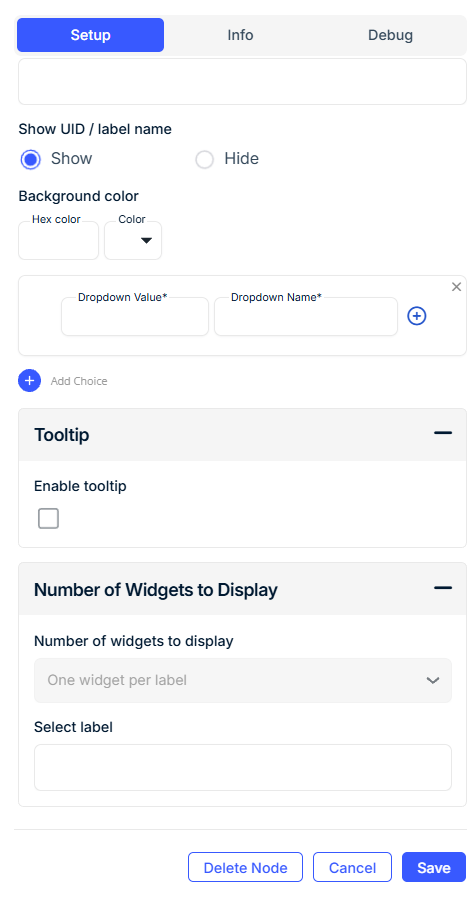
Set Widget Basics
-
Widget Name: Display title of the dropdown (e.g.,
Select Mode,Choose Priority). -
Widget Subtitle (optional): Contextual message shown below the title.
-
Show UID / Label Name: Optionally show the associated device ID or label.
-
-
Define Output Behavior
-
Output JSON Key (also called Data Field Name): The key in the workflow payload where the selected value will be stored.
-
-
Add Dropdown Options
-
For each option, define:
-
Dropdown Name: What the user sees (e.g.,
High,Critical) -
Dropdown Value: What is sent in the outgoing JSON (e.g.,
"H","C")
-
-
Use Add Row to Dropdown to insert more options.
-
Use Add Child Row to Dropdown for grouped/nested values under a parent category.
-
-
Customize Appearance
-
Background Color: Choose a background color using a hex code or color picker.
-
-
Enable Tooltip (optional)
-
Enable and define a Tooltip Text to help users understand the widget’s purpose.
-
-
Configure Grouping and Display Logic
-
Select Label: Choose a saved device label (e.g.,
Zone,Location) to filter and group widgets. -
Grouped Display Mode:
-
No Grouping: One widget per device
-
Group by Label Value: One widget per label value (e.g., "East", "West")
-
Group by Label Name: One widget aggregating all devices under the label
-
-
Number of Widgets to Display: Optionally limit how many widgets appear.
-
Configuration Fields
General Settings
| Field | Requirement | Description |
|---|---|---|
| Widget Name* | Required | The title of the dropdown as seen on the dashboard. |
| Widget Subtitle | Optional | Descriptive text shown below the widget title. |
| Output JSON Key* | Required | The key in the JSON payload where the selected value will be saved. |
| Show UID / Label Name | Optional | Toggle to show device UID or label in the widget display. |
Dropdown Options
| Field | Requirement | Description |
|---|---|---|
| Dropdown Name* | Required | The label that appears in the dropdown list. |
| Dropdown Value* | Required | The value passed to the workflow when this option is selected. |
| Add Row to Dropdown | Optional | Add additional options to the dropdown. |
| Add Child Row to Dropdown | Optional | Create nested options grouped under a parent selection. |
Use child rows when organizing related options under a single category (e.g., device types, locations, categories).
Appearance
| Field | Requirement | Description |
|---|---|---|
| Background Color | Optional | Widget background color in hex format (e.g., #1abc9c). |
Tooltip Settings
| Field | Requirement | Description |
|---|---|---|
| Enable Tooltip | Optional | Show a tooltip when users hover over the widget. |
| Tooltip Text | Optional | The content of the tooltip. |
Grouping & Display Logic
| Field | Requirement | Description |
|---|---|---|
| Select Label | Mandatory (if grouping) | Select a device label for filtering/grouping the widget. |
| Grouped Display Mode | Mandatory | - No Grouping: One widget per device - Group by Label Value: One widget per label value - Group by Label Name: One widget showing all devices |
| Number of Widgets to Display | Optional | Limit how many widgets appear when grouping is enabled. |
Use Cases
-
Choose between device states (e.g.,
Running,Idle,Stopped) -
Select alert categories or priorities
-
Apply tags or classifications for downstream filtering
-
Feed conditional logic with structured user input
Best Practices
-
Keep Dropdown Names user-friendly; use concise Values for logic.
-
Use Tooltip Text to help users understand selection impact.
-
Use Child Rows to visually group related options under a parent.
-
Apply labels and grouping to reduce clutter and simplify navigation.
Frequently Asked Questions (FAQ)
Q: Can I allow users to select more than one option?
A: No. The Drop Down Widget Node supports single selection only. For multi-selection, consider a checkbox-based control.
Q: Can dropdown values be dynamic?
A: No. Dropdown options are statically defined in the widget configuration.
Q: What format is used for sending the selected value?
A: The selected Dropdown Value is sent as the value of the configured Output JSON Key in the workflow payload.
Q: Can I group dropdowns by device category?
A: Yes. Use Grouped Display Mode with Select Label to show dropdowns per label value or group.