
Rayven.io dashboards offer a powerful and flexible way to visualize complex data, turning raw information into meaningful, actionable business insights
Dashboards Overview in Rayven.io
Introduction
Rayven.io dashboards offer a powerful and flexible way to visualize complex data, turning raw information into meaningful, actionable business insights. With highly customizable widgets and a user-friendly drag-and-drop interface, these dashboards are tailored to meet the specific needs of your business. Whether you need real-time monitoring, historical analysis, or operational summaries, Rayven dashboards provide the tools necessary to create impactful visualizations.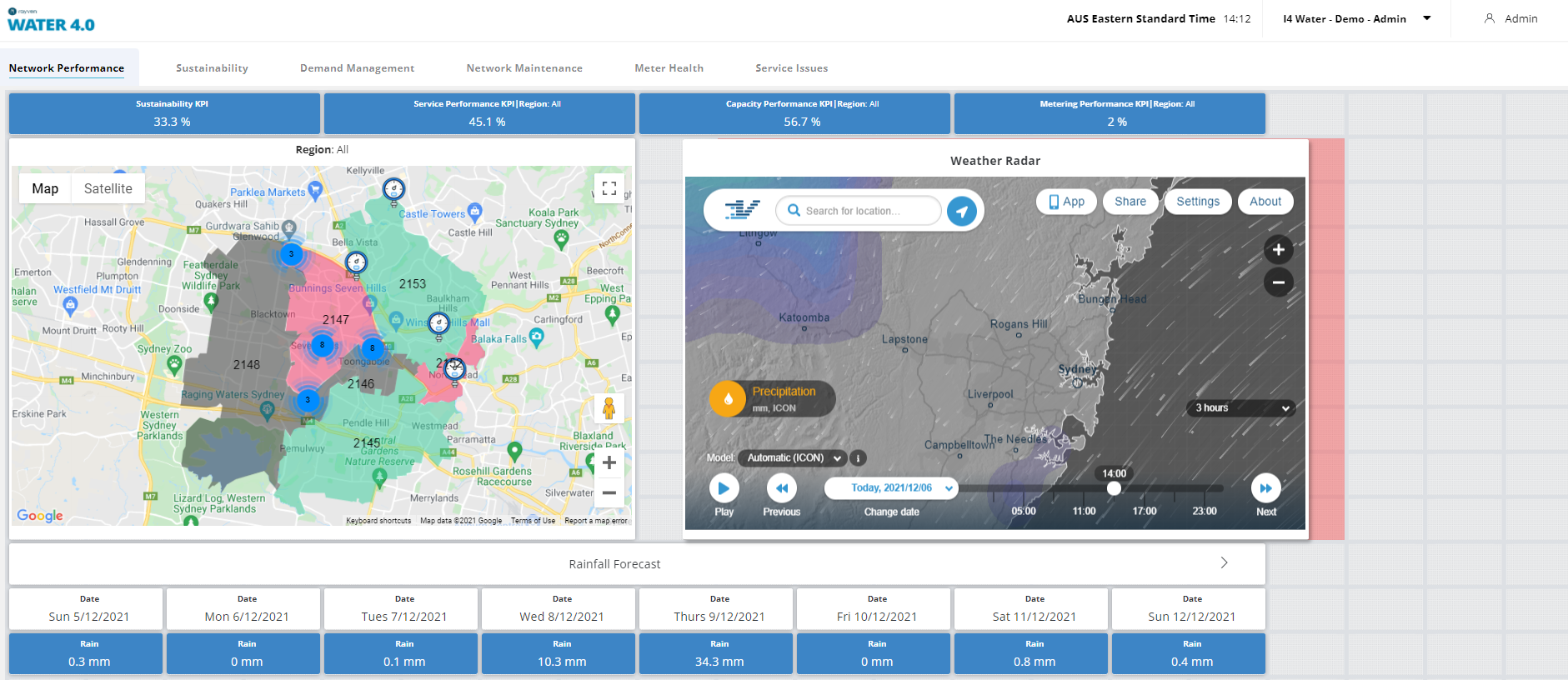
Accessing Dashboards
To access your Rayven dashboard, navigate to https://live.rayven.io/ and log in using your credentials. For details on how to create login credentials, refer to Section 3.5: Dashboard Users in the Rayven documentation.
Dashboard Structure
A single dashboard in Rayven can display data from multiple devices and data sources. These data visualizations can be combined into a single solution by using Dashboard User Groups and Dashboard Users, which help control access and permissions for different users.
Dashboards are composed of various types of widgets that display data in different formats, allowing for maximum flexibility in how information is presented. You can use these widgets to create real-time operational dashboards, reporting interfaces, or analysis tools.
Types of Dashboard Widgets
Rayven.io offers a diverse range of widgets that allow you to visualize your data in alphanumeric formats, charts, or interactive objects. Each widget type is designed to present data in a way that enhances understanding and decision-making.
1. Alphanumeric Widgets
Alphanumeric widgets display raw data as text or numbers and are useful for straightforward metrics and real-time monitoring. The following alphanumeric widgets are available in Rayven:
- Value: Displays a single alphanumeric value, such as a temperature reading or revenue figure.
- Multi-Value: Presents multiple alphanumeric values in a single widget.
- Alert: Shows conditional alphanumeric messages with customizable background colors to signal warnings or alerts.
- Monitor: Displays values with color coding based on set thresholds, useful for performance or operational monitoring.
- Gauge: A gauge meter that represents values within a range and color codes the meter based on the value’s position in that range.
- Percentage: Visualizes data as a percentage bar or column with color coding based on predefined thresholds.
- Level: Displays a tank or container graphic with color coding to represent levels, such as liquid levels or capacity.
- Tabular Data: Shows the most recent instances of multiple data fields in a table format.
- Raw Data: Displays the full historical data for multiple fields in a raw, unfiltered format, allowing for detailed historical analysis.
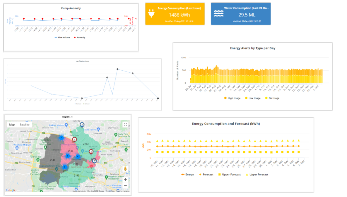
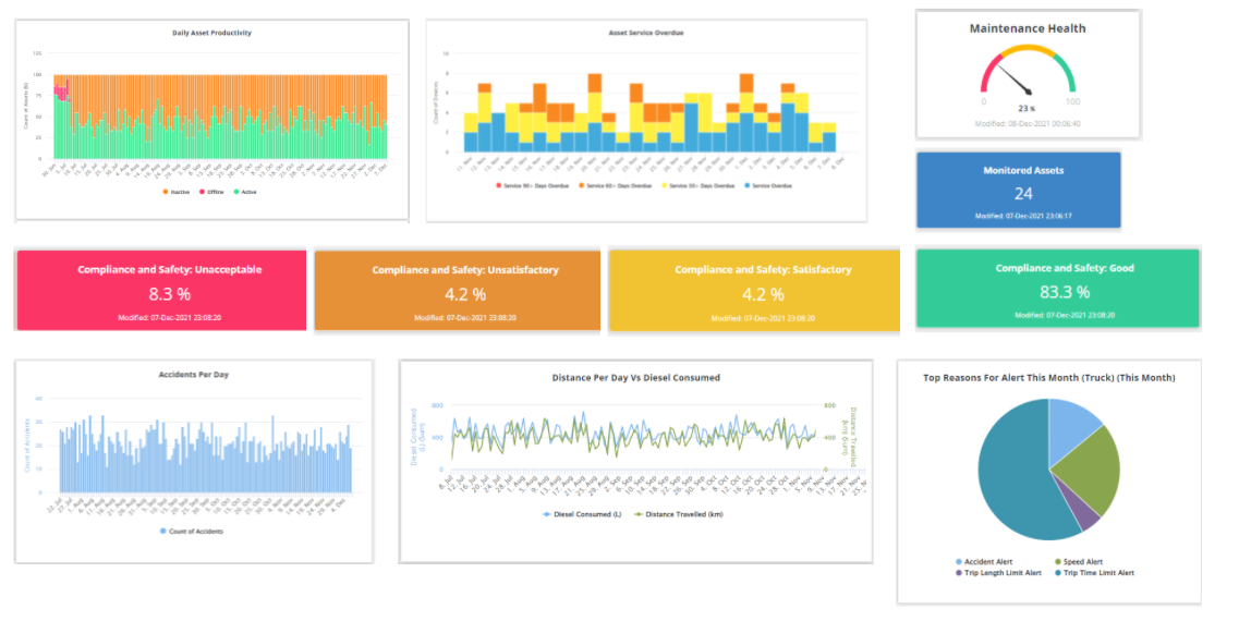
2. Chart Widgets
Chart widgets are essential for visualizing trends, patterns, and comparisons over time. These graphical representations make it easier to spot anomalies, track performance, and forecast future outcomes. Rayven offers the following chart widgets: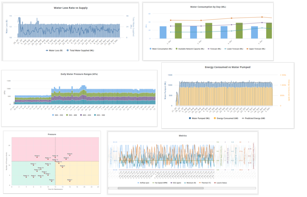
- Pie Chart: Displays proportions of a whole, using devices or fields as segments of the pie to show percentages or comparisons.
- Line Chart: Visualizes data trends over time as a line, with options to include comparison and target lines for tracking performance against benchmarks.
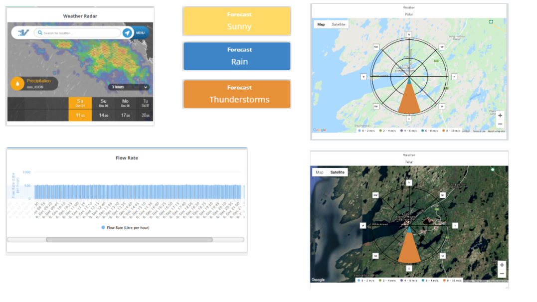
- Bar Chart: Similar to a line chart, but uses bars to represent data points over time, allowing for comparison of different variables.
- Pareto Chart: A combination of a bar and line chart, typically used for analyzing the frequency or impact of issues to prioritize corrective actions.
- Cartesian Chart: Plots data points on a grid, dividing them into configurable quadrants to analyze patterns and correlations.
- Multi-Axes Chart: Visualizes multiple variables on separate axes, using lines or bars to represent data trends simultaneously.
- Forecasting Chart: Uses time-series data to display past trends alongside projected outcomes based on predictive models.
- Control Chart: Displays an I-MR (Individual-Moving Range) control chart with Nelson Rules for quality control and process monitoring.
- Polar Chart: Represents data as vectors distributed over time, often used for cyclical data or directional information.
- Category Bar Chart: Organizes and displays data using fixed categories on the x-axis, suitable for categorical comparisons.
3. Object Widgets
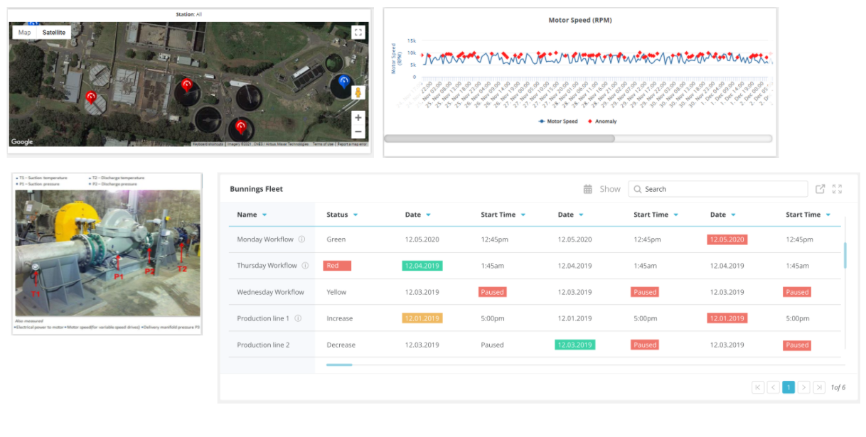
Object widgets allow for the integration of visual elements such as maps, images, or video streams into your dashboard, providing an interactive way to visualize spatial data or real-time visual feeds. The following object widgets are available:
- Map: Displays data points on a map, offering features like geofencing, tracking, proximity alerts, and drill-down capabilities to explore regional or global data.
- Images: Overlays data on a static image, useful for representing data on floor plans, schematics, or other visual references.
- Live Video Stream: Displays real-time data alongside live video feeds, allowing users to monitor operations visually while tracking associated metrics or alerts.
Combining Dashboards and Managing Users
Rayven.io makes it easy to combine multiple dashboards into a single interface, providing comprehensive solutions for monitoring and decision-making. By organizing Dashboard User Groups, you can assign specific dashboards to user roles, ensuring that the right people have access to the right information. This capability is essential for larger organizations with multiple departments or roles that require different data views.
Conclusion
Rayven.io dashboards provide a highly customizable and powerful tool for transforming raw data into actionable insights. With a wide range of widgets and visualizations, Rayven dashboards can be tailored to meet the specific needs of any business or operation. By leveraging its user-friendly interface and flexible configuration options, Rayven.io ensures that your data is accessible, meaningful, and ready to drive smarter decisions.