
Rayven.io allows you to customize the display settings of widgets on your dashboard at any time. This flexibility ensures that your data visualizations remain relevant and tailored to the specific insights you need.
How to Edit a Widget
To edit a widget’s display settings after creating your dashboard:
- Hover over the widget title bar to reveal additional options.
- Click the 'View' icon to open the widget’s configuration panel and make changes.
Changing the Date Range
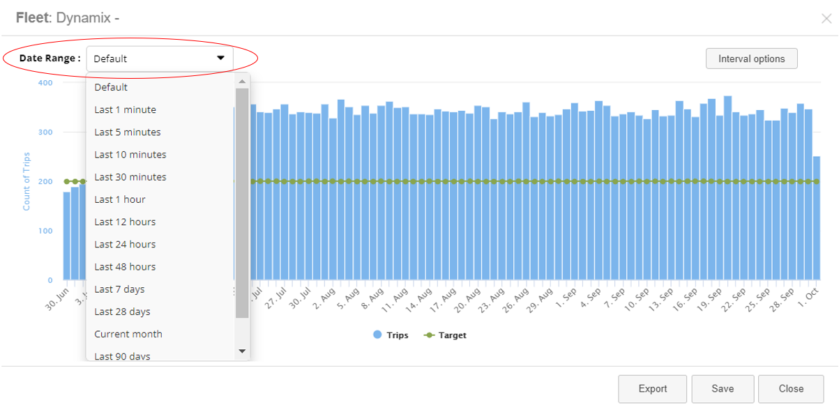
You can adjust the data range displayed on a chart widget by using the following options:
- Drop-down Menu: Select a pre-configured date range from the drop-down list.
- Custom Range: Enter a specific start and end date for a custom time period.
Once you have selected or entered a new data range, click 'Save' to apply the changes. The chart will update to reflect the data for the selected period.
Adjusting or Swapping Target Lines
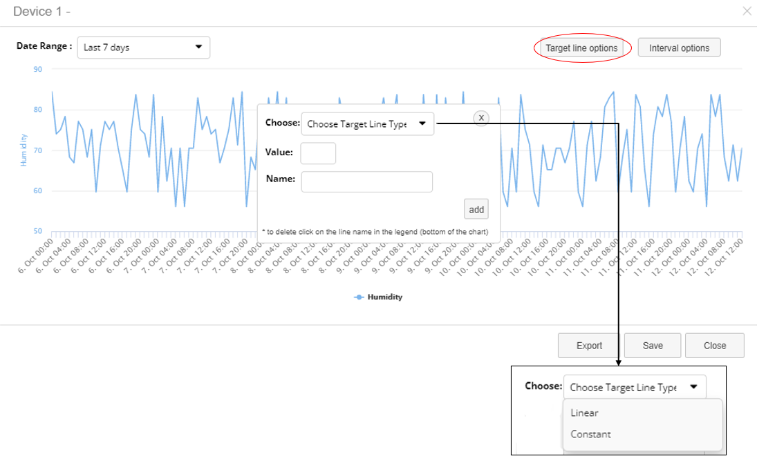
In line charts and bar charts, you can add or edit target lines to enhance your visualizations. There are two types of target lines:
1. Linear Target Lines
- Linear target lines increase progressively by the value you enter.
- The value increases at regular intervals based on the x-axis values. For example, if the target line value is set to 1, the line will increase by 1 at each x-axis interval. If set to 5, it will increase by 5 at each step.
2. Constant Target Lines
- Constant target lines remain static and align with a specific value on the y-axis, creating a horizontal line across the chart.
To configure target lines:
- Click 'Target Line Options'.
- Enter the target line’s value and choose the type (linear or constant).
- Name the target line and click 'Add'.
- Once configured, click 'Save' to apply the target line to the chart.
Target lines help you visualize goals, thresholds, or reference points against the actual data.
Editing Intervals

You can adjust the time intervals on the x-axis of your chart to display data in different units of time:
- Choose from the following options: seconds, minutes, hours, days, weeks, months, or years.
To change the interval:
- Select 'Interval Options'.
- Choose the desired time interval for the x-axis.
- Click 'Save' in the bottom-right corner to confirm your selection.
Adjusting the intervals allows you to fine-tune how the data is displayed, making it easier to spot trends or patterns over specific periods.
Conclusion
Rayven.io’s widget configuration options give users the ability to fine-tune data visualizations to meet their specific needs. Whether adjusting date ranges, adding target lines, or modifying intervals, the platform ensures that your dashboards remain flexible and customizable. By following these simple steps, you can keep your dashboards relevant and actionable, enabling better decision-making based on your data.