![Ravyen Transparent 1390x426-1.png]](https://insights.rayven.io/hs-fs/hubfs/000%20-%20Rayven/Rayven%20Brand%20Assets/Rayven%20Logos/Ravyen%20Transparent%201390x426-1.png?height=50&name=Ravyen%20Transparent%201390x426-1.png)

Step-by-Step: How to Configure the Scatter Plot Widget Node
-
Add the widget
-
Drag the Scatter Plot (Cartesian Chart) Widget Node from the Visualizations panel to the canvas.
-
-
Connect the widget to the data source
-
Link the widget to the upstream workflow node that emits both the X and Y field values.
-
These fields must match the X-axis field name and Y-axis field name in your configuration.
-
Without this connection, the chart will not populate any data.
-
-
Open configuration
-
Double-click the widget to open the settings window.
-
-
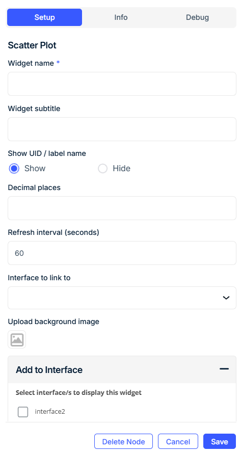
Configure General Display Settings
-
Widget Name: Title of the widget (e.g.,
Efficiency Map). -
Widget Subtitle (optional): Additional context or instructions.
-
Show UID / Label Name: Toggle to display the associated device name or label.
-
Decimal Precision: Set the number of decimals shown per point.
-
Auto-scale by min/max values (optional): Let the chart automatically adjust axis bounds.
-
Widget Refresh Interval: Set how often the chart refreshes (default: 60 seconds).
-
Upload Background Image (optional): Add an image for context (e.g., plant layout).
-
Dashboard to Link To (optional): Link to another dashboard interface on click.
-
Axis Configuration
X-Axis
| Field | Requirement | Description |
|---|---|---|
| Name of X-axis* | Required | Label to show on the horizontal axis. |
| X-axis Minimum / Maximum Value* | Required | Defines visible axis range. |
| X-axis Center Value | Optional | Adds a vertical center line for visual reference. |
| X-axis Field Name* | Required | JSON key from the payload used for X values. |
| X-axis Function* | Required | Value calculation method: Last, Average, Min, Max, Sum. |
| Calculation Interval | Required if not using Last |
Length of the time window to aggregate. |
| Units of Measurement | Required if not using Last |
Choose from Seconds, Minutes, Hours, etc. |
Y-Axis
| Field | Requirement | Description |
|---|---|---|
| Name of Y-axis* | Required | Label to show on the vertical axis. |
| Y-axis Minimum / Maximum Value* | Required | Defines visible axis range. |
| Y-axis Center Value | Optional | Adds a horizontal center line for visual reference. |
| Y-axis Field Name* | Required | JSON key from the payload used for Y values. |
| Y-axis Function* | Required | Value calculation method: Last, Average, Min, Max, Sum. |
| Calculation Interval | Required if not using Last |
Length of the time window to aggregate. |
| Units of Measurement | Required if not using Last |
Choose from Seconds, Minutes, Hours, etc. |
Color Rules (Optional)
Apply custom color rules to data points based on conditions:
| Field | Requirement | Description |
|---|---|---|
| Input Data Field | Required | JSON key to evaluate (usually X or Y key). |
| Operator | Required | Select from =, <, >. |
| Value | Required | Threshold to compare against. |
| Color | Required | Color to apply (hex code or RGB). |
Add multiple rules using the Add Color button.
Quadrants (Optional)
Define quadrant background colors using center values as dividers:
| Quadrant | Requirement | Description |
|---|---|---|
| Top Left | Optional | Color for upper-left quadrant |
| Top Right | Optional | Color for upper-right quadrant |
| Bottom Left | Optional | Color for lower-left quadrant |
| Bottom Right | Optional | Color for lower-right quadrant |
Tooltip & Navigation
| Field | Requirement | Description |
|---|---|---|
| Show Tooltip | Optional | Enable to show point info on hover. |
| Tooltip Text | Optional | Custom tooltip content. |
| Dashboard to Link To | Optional | Navigate to another dashboard when clicked. |
| Upload Background Image | Optional | Use floorplans or schematics as chart backgrounds. |
Interface & Grouping
| Field | Requirement | Description |
|---|---|---|
| Add to Interface | Required | Select dashboard interface(s) where this chart will appear. |
| Select Label | Required (if grouped) | Choose a device label for grouping. |
| Grouped Display Mode | Required | - No Grouping - Group by Label Value - Group by Label Name |
| Number of Widgets to Display | Optional | Cap how many widgets appear if grouped. |
Use Cases
-
Track power vs. temperature over time
-
Plot accuracy vs. speed across devices
-
Visualize spatial positioning or floor-based data (with background image)
-
Segment zones or quadrants based on performance
Best Practices
-
Use center lines and quadrants to mark critical thresholds visually.
-
Connect to a clean upstream node that only emits numeric values.
-
Color rules are especially useful when visualizing KPIs or threshold breaches.
-
Use background images to add context to spatial plots.
Frequently Asked Questions (FAQ)
Q: Can I plot multiple points at once?
A: Yes, using grouping or label filters to differentiate data streams per widget.
Q: Can I use color rules to highlight risk zones?
A: Absolutely. Use the color picker rules to highlight any points that exceed thresholds.
Q: What if I only want to show one quadrant?
A: Set the axis min/max and center values to isolate the region of interest.
Q: Can this chart update live?
A: Yes, the widget refreshes based on the Widget Refresh Interval you configure.