![Ravyen Transparent 1390x426-1.png]](https://insights.rayven.io/hs-fs/hubfs/000%20-%20Rayven/Rayven%20Brand%20Assets/Rayven%20Logos/Ravyen%20Transparent%201390x426-1.png?height=50&name=Ravyen%20Transparent%201390x426-1.png)
Step-by-Step: How to Configure the Button Node
-
Drag the Button node into your workflow
-
Go to Controls in the Rayven Workflow Builder.
-
Drag the Button Node onto the canvas.
-
-
Double-click to configure
-
Input/output connections are optional.
-
The button emits its value directly into the payload when clicked.
-
-
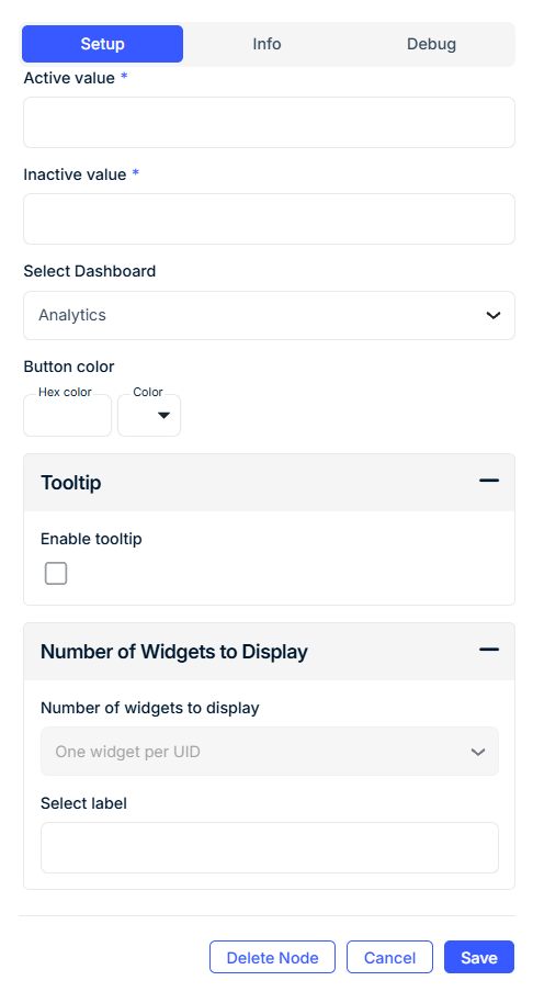
Enter General Information
-
Widget Name: Give the button a clear label (e.g.,
Toggle Pump,Start Cycle). -
Button Type: Choose between
Button(single-action) orSwitch(toggle between values). -
Widget Subtitle (optional): Provide additional context below the title.
-
Show UID / Device Label Name: Toggle this if you want to display the associated device or label name on the button widget.
-
-
Set Output Behavior
-
Data Field Name: Define the output key that will be used in the JSON payload.
-
On Value: Value sent when the button is activated (
e.g., true,start,1). -
Off Value: Value sent when the button is deactivated or toggled off.
-
-
Customize Appearance
-
Button Color: Choose a predefined color or enter a hex code (
#00BFFF). -
Tooltip (optional): Enable and define a tooltip message to show on hover.
-
-
Optional: Grouping by Device Label
-
Select Label: Choose a device label (e.g., “Zone”, “Machine Type”) to filter which devices the widget affects.
-
Grouped Display:
-
No Grouping: One widget per device (Button only).
-
Group by Label Value: One widget per label value (e.g., all "Zone A" devices).
-
Group by Label Name: One widget for all devices in the label group.
-
-
🔧 Configuration Fields
General
| Field | Requirement | Description |
|---|---|---|
| Widget Name* | Required | The button’s visible name in the interface. |
| Button Type* | Required | Button (single click) or Switch (on/off toggle). Only Switch supports grouping. |
| Widget Subtitle | Optional | Additional context shown beneath the main label. |
| Show UID / Label Name | Optional | Display the device ID or label alongside the widget. |
Data Output
| Field | Requirement | Description |
|---|---|---|
| Data Field Name* | Required | The key in the outgoing payload (e.g., "deviceCommand"). |
| On Value* | Required | Value emitted when the button is pressed or toggled ON. |
| Off Value* | Required | Value emitted when the button is toggled OFF (only applies to switches). |
Appearance
| Field | Requirement | Description |
|---|---|---|
| Button Color | Optional | Use the color picker or enter a hex value (#FF4500). |
Tooltip Configuration
| Field | Requirement | Description |
|---|---|---|
| Show Tooltip | Optional | Enable tooltip on hover. |
| Tooltip Text | Optional | Message displayed when hovering over the button. |
Grouping by Label
| Field | Requirement | Description |
|---|---|---|
| Select Label | Required (for grouping) | Choose a label from the Workspace (e.g., "Zone", "Line", etc.). |
| Grouped Display Mode | Required | - No Grouping: One widget per device (Button only). - Group by Label Value: One widget per label value. - Group by Label Name: One widget for all devices in the label group. |
🔎 Note: Only Switches support grouping. Buttons must be configured with "No Grouping".
Use Cases
-
Manual device control: Toggle relays, pumps, or switches.
-
Triggering workflow actions: Start or stop logic flows.
-
User acknowledgment: Confirm completion of tasks.
-
Mode switching: Change operational state (e.g.,
Auto↔Manual).
Best Practices
-
Use Switch for toggle scenarios and Button for one-time triggers.
-
Keep the Data Field Name unique across buttons to avoid key collisions.
-
Use Tooltips to guide users on button purpose or behavior.
-
When grouping, make sure device labels are correctly assigned and saved.
Frequently Asked Questions (FAQ)
Q: What’s the difference between Button and Switch?
A: Button sends a single output when clicked. Switch toggles between two states (on/off) and sends values accordingly.
Q: Can I display a button per device?
A: Yes. Use No Grouping and enable One widget per UID (only available with Button type).
Q: How do I ensure the output only affects a subset of devices?
A: Use the Select Label field to filter the devices affected and group widgets by label values.
Q: What value gets passed to the workflow?
A: The value defined in On Value or Off Value is sent in the payload under the Data Field Name.