![Ravyen Transparent 1390x426-1.png]](https://insights.rayven.io/hs-fs/hubfs/000%20-%20Rayven/Rayven%20Brand%20Assets/Rayven%20Logos/Ravyen%20Transparent%201390x426-1.png?height=50&name=Ravyen%20Transparent%201390x426-1.png)
What Is a Bar Chart?
A bar chart is a type of graph that displays categorical or time-series data using rectangular bars. The X-axis typically represents time or categories, while the Y-axis shows the value associated with each time slice or category.
In Rayven, the Bar Chart Widget Node visualizes time-series data pulled from workflow payloads and presents it in customizable time intervals with options for tooltips, linking, precision control, and real-time updates.
Step-by-Step: How to Configure the Bar Chart Widget Node
-
Add the widget
-
Drag the Bar Chart Widget Node from the Visualizations panel to the canvas.
-
-
Open configuration
-
Double-click the widget to open its configuration window.
-
-
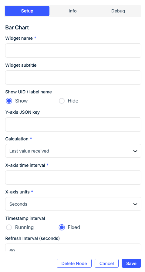
Set General Display
-
Widget Name: Title (e.g.,
Temperature Chart). -
Widget Subtitle (optional): Contextual message.
-
Show UID / Label Name: Toggle to display the device UID or label.
-
Bar Color: Pick a hex color (e.g.,
#27ae60). -
Decimal Precision: Set the number of decimals to display on bars.
-
Y-axis Title (optional): Label for the Y-axis (e.g.,
kWh,°C). -
Interval Options Button: Show/hide controls for modifying time intervals on the dashboard.
-
-
Configure Data Inputs & Function
-
Y-Axis Field: The key from the JSON payload that holds the numeric data.
-
Function: Select how data is aggregated:
-
Sum,Average,Maximum,Minimum,Last value received,Last Value from Each Device with Common Tag
-
-
-
Configure Time Behavior
-
X-axis Time Interval: Integer duration of each time bucket (e.g.,
5,15,60). -
Units of Measurement: Time units (e.g.,
Seconds,Minutes,Hours,Days,Weeks,Months,Years). -
Data Point Increments:
-
Running: Based on incoming data timestamp -
Fixed: Rounds timestamp to a fixed window
-
-
Widget Refresh Interval (optional): How often the chart refreshes (default:
60s).
-
-
Configure Output (Optional)
-
Output Field Name: Set a custom field for processed values.
-
-
Set Axis Limits (Optional)
-
Range Min and Range Max: Fix Y-axis bounds for consistency.
-
-
Enable or Suppress Data
-
Enable Display of Future Data: Show future/forecasted bars.
-
Hide Data: Temporarily hide values without deleting the widget.
-
-
Date Format Options
-
X-axis Format: Choose from
Default,Date Only,Time Only. -
Tooltip Format: Same options apply for the tooltip time display.
-
-
Apply Delay (Optional)
-
Apply Delay: Enable to delay when data appears.
-
Delay Size: Integer (e.g.,
5). -
Delay Units: Choose time units (e.g.,
Minutes,Hours).
-
-
Enable Tooltip (Optional)
-
Show Tooltip: Toggle on.
-
Tooltip Text: Provide help text shown when hovering.
-
Show Data Sources in Tooltip: Display the raw field sources in the tooltip.
-
-
Configure Dashboard Navigation (Optional)
-
Dashboard to Link To: Define a target interface users can navigate to when clicking.
-
Node to Link To: Specify a node to focus on in the linked interface.
-
-
Add to Interface(s)
-
Assign the widget to one or more interfaces for display.
-
-
Group and Display Settings
-
Select Label: Use a saved label to filter/group devices.
-
Grouped Display Mode:
-
No Grouping: One widget per device
-
Group by Label Value: One per label value (e.g., per zone)
-
Group by Label Name: One combined widget
-
-
Number of Widgets to Display: Limit the number shown on grouped interfaces.
-
🔧 Configuration Fields Summary
General Settings
| Field | Requirement | Description |
|---|---|---|
| Widget Name* | Required | Title shown on dashboard |
| Widget Subtitle | Optional | Contextual description |
| Show UID / Label Name | Optional | Display associated device identifier |
| Bar Color | Optional | Hex color code (e.g., #2980b9) |
| Decimal Precision | Optional | Number of decimal places to display |
| Interval Options Button* | Required | Toggle to allow user interval adjustment |
| Y-axis Title | Optional | Text label for the Y-axis |
Data & Time Settings
| Field | Requirement | Description |
|---|---|---|
| Y-Axis Field* | Required | JSON key to chart |
| Function* | Required | Aggregation method (Sum, Average, etc.) |
| X-axis Time Interval* | Required | Interval size (e.g., 5, 60) |
| Units of Measurement* | Required | Time units (e.g., Minutes, Hours) |
| Data Point Increments* | Required | Running or Fixed time logic |
| Widget Refresh Interval | Optional | Refresh rate in seconds (default: 60) |
Output & Range
| Field | Requirement | Description |
|---|---|---|
| Output Field Name | Optional | Custom field name for output |
| Range Min | Optional | Fixed minimum Y-axis value |
| Range Max | Optional | Fixed maximum Y-axis value |
| Enable Future Data | Optional | Show future/forecasted values |
| Hide Data | Optional | Hide data while retaining the widget |
Delay Options
| Field | Requirement | Description |
|---|---|---|
| Apply Delay | Optional | Enable delay mode |
| Delay Size | Required if enabled | Integer value for delay duration |
| Delay Units | Required if enabled | Time unit (e.g., Minutes, Hours) |
Tooltip & Linking
| Field | Requirement | Description |
|---|---|---|
| Show Tooltip | Optional | Display tooltip on hover |
| Tooltip Text | Optional | Custom tooltip content |
| Show Data Sources in Tooltip | Optional | Reveal field sources in tooltip |
| Dashboard to Link To | Optional | Dashboard for navigation |
| Node to Link To | Optional | Node focus target when linked |
Grouping & Interface
| Field | Requirement | Description |
|---|---|---|
| Select Label | Required (if grouped) | Device label to group or filter widgets |
| Grouped Display Mode | Required | Group by device, label value, or label name |
| Number of Widgets to Display | Optional | Cap widgets shown when grouped |
| Add to Interface | Required | Assign the widget to dashboard interface(s) |
Use Cases
-
Track real-time sensor data at 5-minute intervals
-
Compare device metrics by zone or type using label grouping
-
Visualize production output trends
-
Monitor system health, energy consumption, or batch performance
Best Practices
-
Use Fixed increments for clean, aligned time labels
-
Set decimal precision according to the sensitivity of your data
-
Apply grouping to scale the chart for fleets or batch systems
-
Use tooltips and linking for drill-down workflows
-
Enable future data for predictive models or simulation outputs
Frequently Asked Questions (FAQ)
Q: Does this widget store data?
A: No. It visualizes data already present in the workflow payload.
Q: What happens if no value is received in a time bucket?
A: The chart may show an empty bar or omit it depending on your function and data point increment type.
Q: Can this chart display multiple series?
A: No. Each Bar Chart Widget shows one field. Use multiple widgets for comparisons.
Q: Can I delay the display of recent data?
A: Yes. Use the Apply Delay setting to postpone visibility of incoming data.